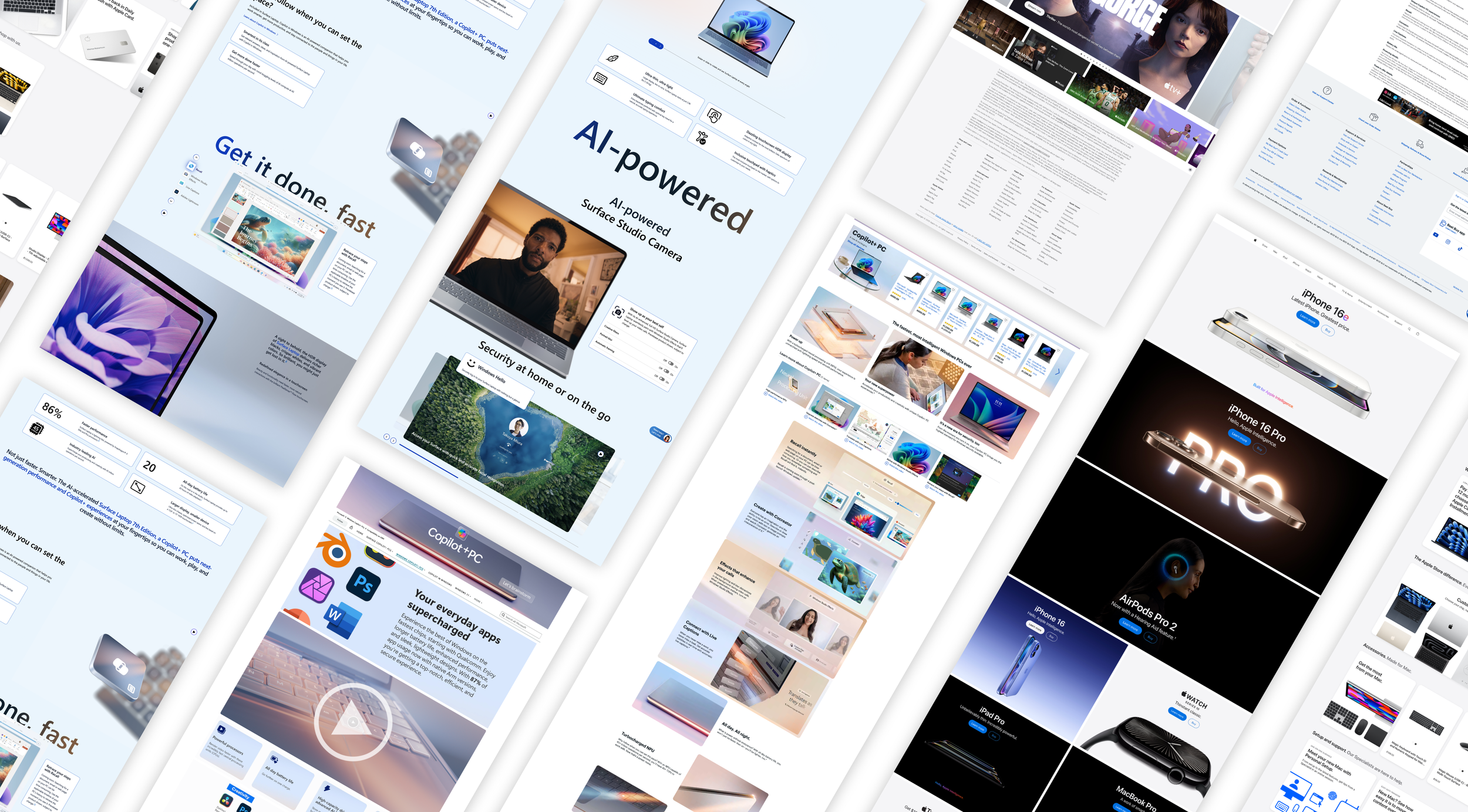
Copilot Brand Integration Journey
A UX Audit
The Project:
This project explores how leading tech platforms integrate AI-driven branding into their existing ecosystems, using the concept curve as a framework to visualize the user journey. By mapping the rise and fall of branding intensity across touchpoints, we uncover how Microsoft, Best Buy, Amazon, and Apple balance innovation with consistency.
The Goal:
This case study is dedicated to exploring the intersection of branding, UI, and user perception, highlighting how design decisions influence both product identity and user engagement. By analyzing how major companies integrate AI-driven features into their ecosystems, the goal is to demonstrate how thoughtful design not only communicates innovation but also builds trust, consistency, and meaningful connections with users as they navigate new technologies.
Overview:
Each case study examines where AI branding peaks, where it recedes, and how seamlessly it merges with the parent experience. From Windows’ dramatic climb into Copilot identity, to Best Buy’s retail-to-innovation shifts, Amazon’s hybrid integration, and Apple’s steady, controlled approach — these analyses highlight the diverse strategies companies use to introduce emerging technologies without disrupting user trust.
Reading the
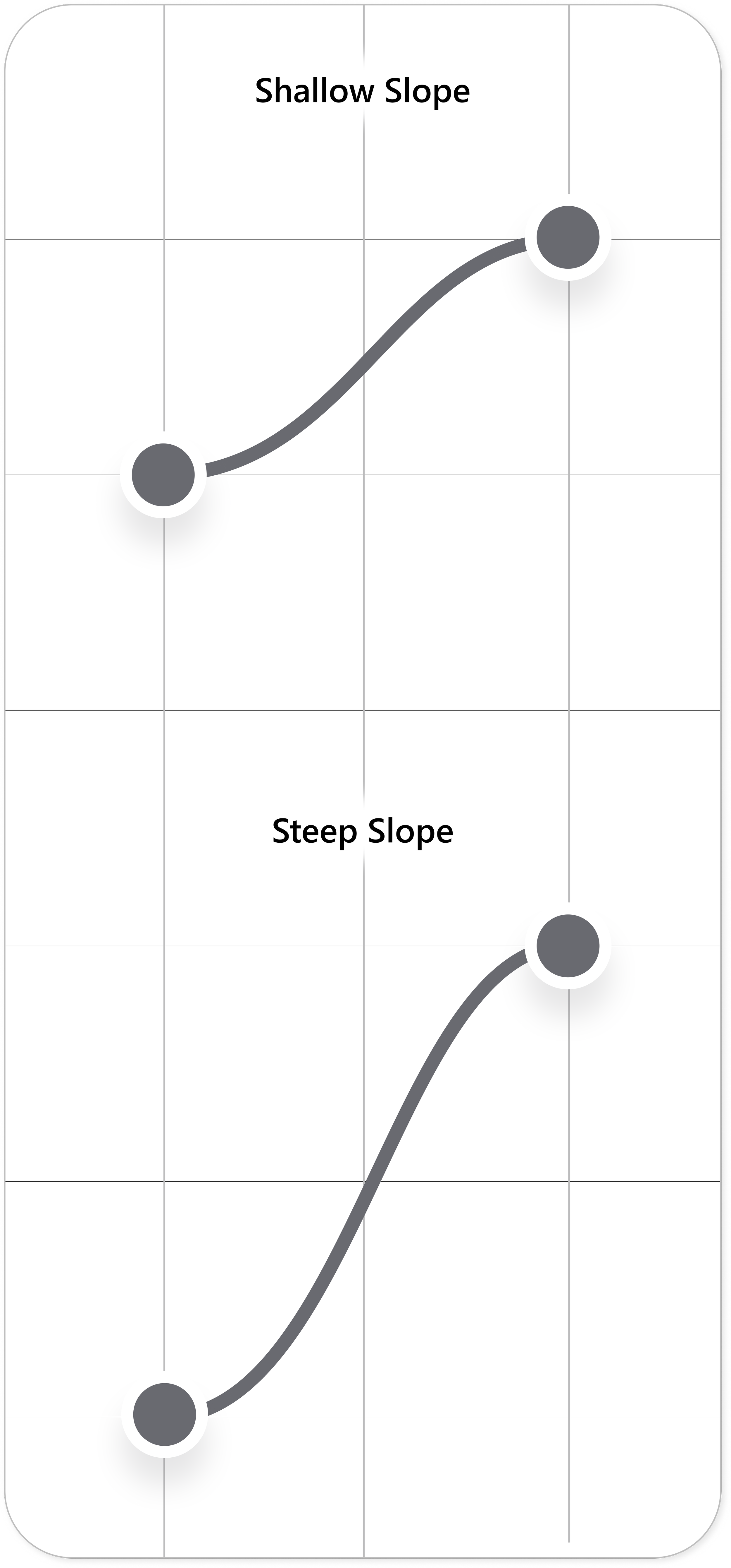
Brand Slope
Shallow Slope
A shallow upward slope would indicate a slow and subtle shift in design elements, where new branding is introduced progressively rather than abruptly.
Conversely, a shallow downward slope would suggest a gradual return to the original branding, maintaining a sense of continuity and familiarity. Shallow slopes generally imply a smoother, less disruptive user experience, where changes feel more integrated and natural rather than sudden or jarring.
Steep Slope
A steep upward slope indicates a sudden and noticeable shift in design elements—such as a bold transition from one brand identity to another, the introduction of a drastically different UI, or the application of highly customized marketing elements. This can create a more eye-catching, immersive, or disruptive user experience.
Conversely, a steep downward slope suggests a quick return to the original branding, often signaling a re-establishment of familiarity after an intense marketing or promotional experience. Steep slopes are often used strategically to capture attention, emphasize key content, or create a clear visual and experiential distinction between different sections of a journey.
-
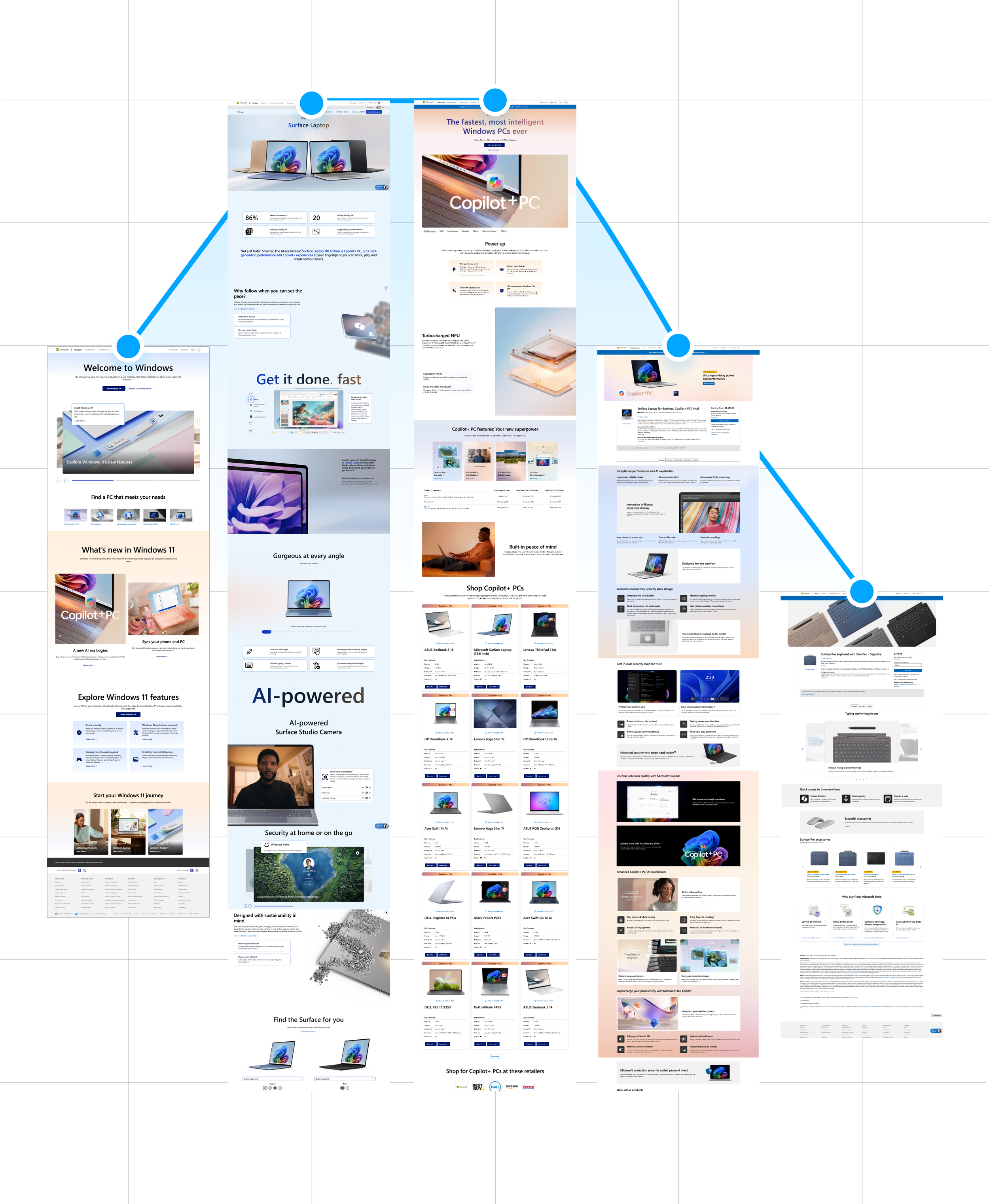
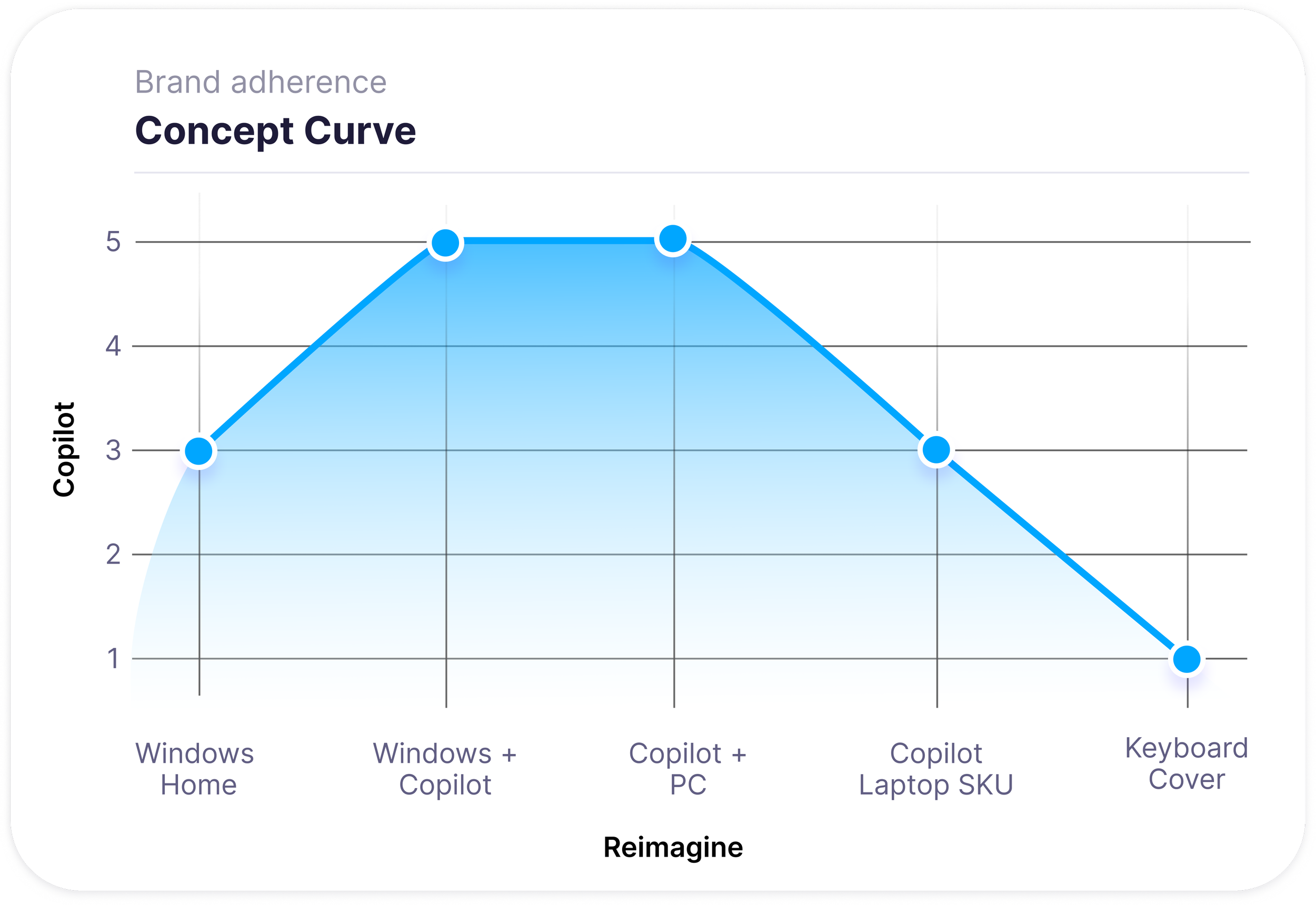
When analyzing the branding and UI journey of a user navigating Microsoft Copilot content within the Windows ecosystem, the concept curve begins midway up the graph. Unlike third-party retailers, Windows already shares a strong visual and functional alignment with Copilot, meaning that the starting point leans naturally toward Copilot’s branding. From the outset, elements such as Windows’ modern UI, soft gradients, and minimalistic design language create a seamless foundation where Copilot’s presence feels native rather than intrusive.
-
As users progress toward more Copilot-specific content, the curve experiences a steep upward climb, indicating a rapid and noticeable shift into Copilot’s distinct branding. This transition is most evident in dedicated marketing pages, AI feature showcases, and interactive previews, where the interface fully embraces Copilot’s signature floating elements, rounded components, and human-centric visuals. The branding reaches its peak at the "Copilot + PC" page, where the experience is entirely centered around Microsoft’s AI-driven innovations. At this stage, Windows branding takes a backseat, allowing Copilot’s identity to be the focal point.
-
From this climax point, the curve quickly declines as users transition into product details, technical specifications, and accessory pages. Here, Windows branding reasserts itself strongly, with Copilot elements becoming more subtle and integrated rather than front-facing. The UI returns to a more structured, familiar Windows framework, ensuring clarity and usability for users making purchasing or setup decisions.
-
This bell-shaped concept curve with a steep ascent and rapid descent highlights how Microsoft Windows strategically amplifies Copilot branding when engagement is highest while ensuring a smooth return to Windows' core identity for essential product interactions. By allowing for a dynamic yet controlled branding shift, Windows creates an experience that feels both innovative and cohesive within the broader Microsoft ecosystem.
Mapping the Copilot Branding Curve

-
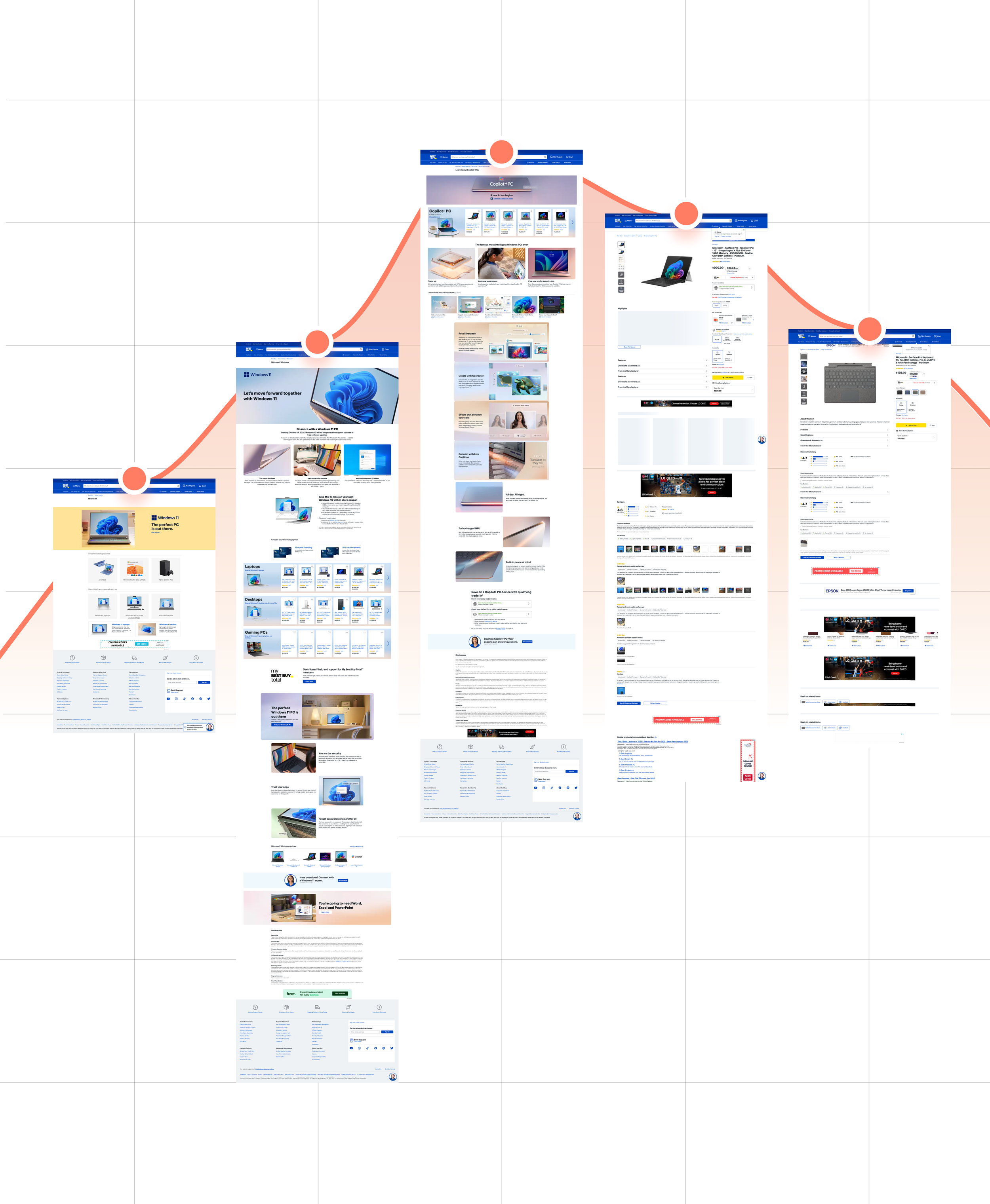
In mapping the branding and UI journey of a user navigating Microsoft Copilot content within Best Buy’s digital ecosystem, we observed a distinct concept curve that reflects the transition between Best Buy’s core branding and Copilot’s marketing-driven design. This curve begins at a low score, representing Best Buy’s established UI—characterized by its familiar blue and yellow color scheme, structured grid layout, and retail-focused interface.
-
As the user progresses towards Microsoft Copilot-related content, the curve takes a steep upward climb, indicating a dramatic shift in branding. This transition is particularly evident on landing pages and promotional sections where Copilot’s identity takes center stage. Here, Best Buy’s retail-oriented UI gives way to Copilot’s lighter, more fluid design, incorporating rounded edges, floating elements, and an AI-driven, futuristic aesthetic. This shift is intentional, drawing attention to the innovation behind Copilot and differentiating it from standard product listings.
-
The climax of the curve is reached at the "Learn More About Copilot" page, where the branding is at its most distinct from Best Buy’s default identity. This page immerses users fully in Microsoft’s Copilot ecosystem, leveraging its signature soft blues, approachable typography, and human-centric imagery to create an informative and engaging experience. The UI at this point leans heavily into storytelling and marketing, reinforcing the transformative potential of Copilot within a user's workflow.
-
Following this peak, the curve begins a gradual descent as the user moves into product-specific pages and ultimately toward checkout. Best Buy’s branding reasserts itself, ensuring a seamless transition back into the standard e-commerce experience. Product details, pricing, and purchasing options return to the retailer’s more structured, transactional UI, providing a familiar and trusted environment for completing the purchase.
This bell-shaped concept curve effectively illustrates how Best Buy accommodates Microsoft Copilot’s branding within its digital framework, balancing immersive marketing with the need for a cohesive and recognizable shopping experience. By leveraging this dynamic branding shift, Best Buy maximizes engagement without disrupting user confidence in its core retail experience.
The Copilot Branding Journey Within Best Buy
-
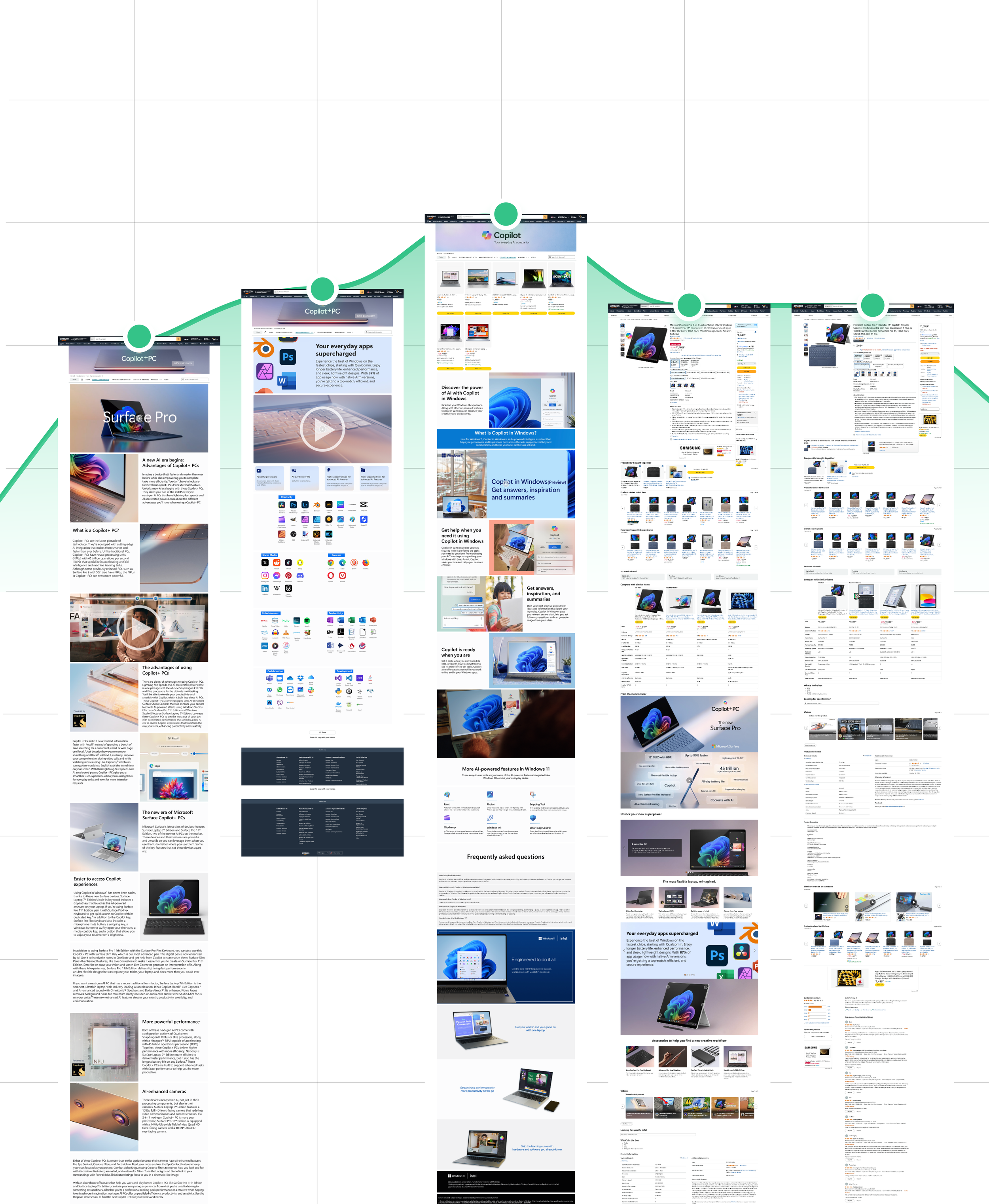
In analyzing the branding and UI journey of a user navigating Microsoft Copilot content within Amazon’s ecosystem, we observed a concept curve that starts at a relatively high point on the graph. Unlike other retailers, Amazon’s integration of Copilot branding begins immediately, reflecting the platform’s ability to seamlessly blend product marketing with its shopping experience. From the outset, elements such as Copilot’s signature light color palette and bespoke product images are incorporated alongside Amazon’s standard interface, creating a hybrid branding experience.
-
As users progress through Copilot-related content, the curve experiences a shallow upward slope, indicating a gradual yet noticeable increase in bespoke Copilot branding. This is particularly evident on landing pages and promotional sections, where the marketing focus intensifies. Here, Copilot’s identity becomes more dominant, leveraging immersive visuals, AI-driven messaging, and interactive elements that differentiate it from Amazon’s typical product listings.
-
The climax of the curve occurs at the “Copilot in Windows” page, where the branding reaches its peak. At this stage, the experience is heavily embedded in Microsoft’s design language, with minimal Amazon-specific UI elements present. The page serves as an informational hub, reinforcing Copilot’s role within Windows and providing users with engaging content, such as feature demos, FAQs, and AI-driven assistance insights.
-
From this peak, the curve begins a gradual decline as users transition into product-specific pages and purchasing options. Amazon’s branding subtly re-emerges, ensuring a smooth shift back into the familiar retail environment while still maintaining Copilot’s presence in a more integrated way. Notably, as users move from the device product page to the accessories page, the branding remains consistent, creating a flatline on the graph. This suggests that while the marketing-heavy elements of Copilot branding are scaled back, its UI and visual identity remain present across related product pages, reinforcing continuity within the shopping experience.
This bell-shaped concept curve with a high starting point and a shallow slope illustrates how Amazon leverages its flexible UI framework to seamlessly integrate Copilot branding without disrupting the overall shopping experience. By allowing for an organic blend of marketing and retail UI, Amazon ensures that users remain engaged with Copilot’s unique value proposition while maintaining consistency as they explore related products.
Mapping the Copilot Curve in Amazon’s Ecosystem

The Apple Intelligence Branding Journey Within the Apple Ecosystem
*This brand does not explore a brand integration with Copilot, rather, it analyizes Apple’s textbbok approach to a successful brand integration for the sake or comparing and goal setting.
-
In analyzing the branding and UI journey of a user navigating Apple Intelligence content within Apple’s ecosystem, we observed a concept curve that maintains a steady and consistent slope throughout the experience. Unlike other retailers or platforms that experience dramatic shifts between parent branding and integrated products, Apple’s approach ensures that all elements—regardless of marketing emphasis—feel inherently Apple.
-
From the moment a user engages with Apple Intelligence content, the branding remains seamlessly woven into the broader Apple ecosystem. There is no stark departure from Apple’s core UI; instead, Apple Intelligence is introduced as an extension of the existing design language, rather than a separate, highly custom entity. This is achieved through the continued use of Apple’s signature minimalist aesthetics, fluid animations, refined typography, and harmonious color palettes, ensuring that the experience feels native across all touchpoints.
-
Rather than experiencing a steep rise into “bespoke” marketing-heavy branding, the concept curve follows a smooth, steady trajectory, reflecting Apple’s ability to subtly elevate branding without making it feel disconnected from the parent experience. Even as users reach high-engagement moments—such as deep-diving into Apple Intelligence’s capabilities or interacting with marketing-rich product pages—the shift remains subtle and controlled. Unlike other brands where marketing-driven pages create a peak in the concept curve, Apple’s tight brand integration prevents dramatic spikes, keeping the experience consistently within the Apple ecosystem.
-
As users transition from Apple Intelligence’s feature highlights back to product pages, purchasing options, and device details, the branding remains equally seamless. There is no significant decline in the concept curve—rather, the journey flows naturally back into standard Apple content without noticeable shifts. This consistency reinforces Apple’s branding philosophy, ensuring that even when highlighting new innovations, the company never compromises its core identity.
This steady and controlled concept curve exemplifies Apple’s mastery in integrating sub-brands and new technologies without creating fragmentation. By making Apple Intelligence feel like an inherent part of its ecosystem rather than a distinct entity, Apple ensures a cohesive, immersive, and uninterrupted brand experience that strengthens user trust and engagement.


Concept Curve Matrix

Observations:
This stacked graph allows us to visually compare user journeys across different brands, providing insight into how our branding integration measures up against competitors. By analyzing these slopes, we can identify key trends, assess the impact of branding transitions, and refine our approach to create a more seamless and engaging user experience.
Observations:
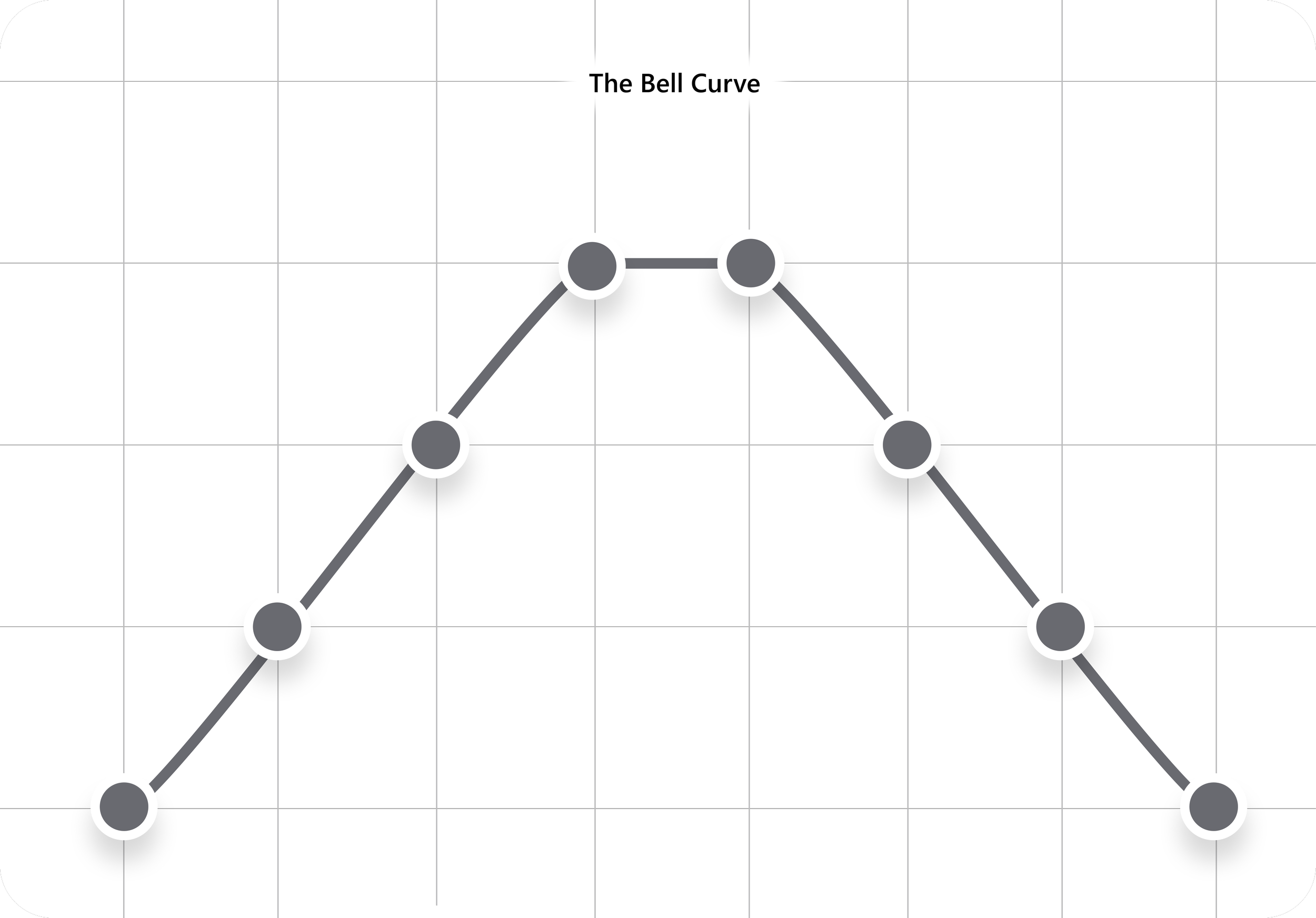
A bell curve is a graph that follows a symmetrical, peak-shaped distribution, where values start low, gradually increase to a central high point, and then decline back to lower values. In the context of branding and UI application, a bell curve often represents the natural progression of a user's journey, where branding transitions from familiar (on-brand) to more customized marketing elements before returning to the original identity. We expect to see this shape in graphs like the concept curve because user experiences typically involve gradual immersion into promotional content, peaking at the most marketing-heavy pages, and then tapering back as they move toward transactional or product-detail-focused sections. This reflects how brands strategically introduce, emphasize, and then reintegrate marketing-driven experiences within their ecosystem.