Archer Ale House Brand Redesign
Archer Ale House is a a locally owned and operated English Style Pub established in 1992. Their logo and overall brand was dated and the transforming college town demographic called for a rebrand.
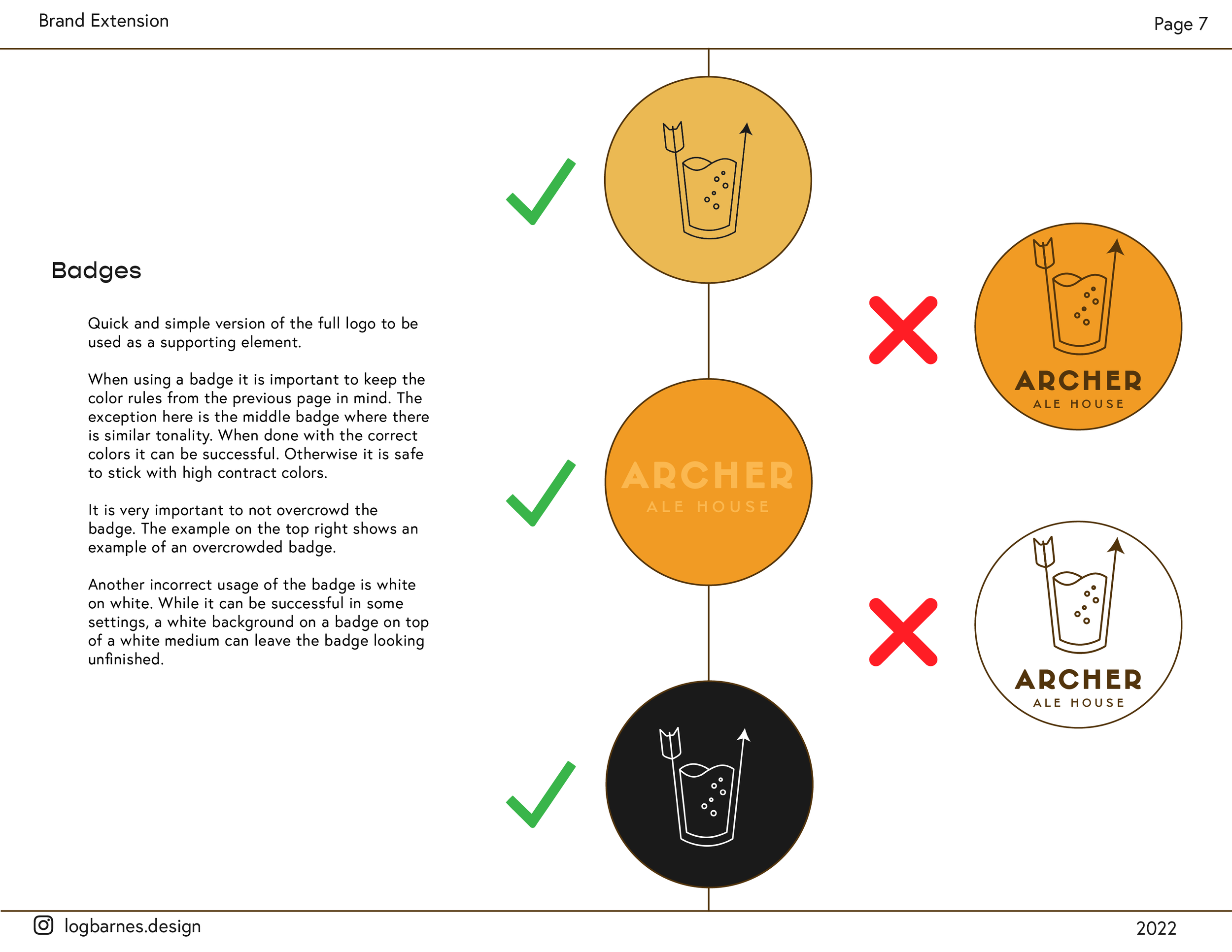
The goal with this project was to start with a minimalistic logo and build a brand off of the logo itself.
“We’re a sure shot with no strings attached!”
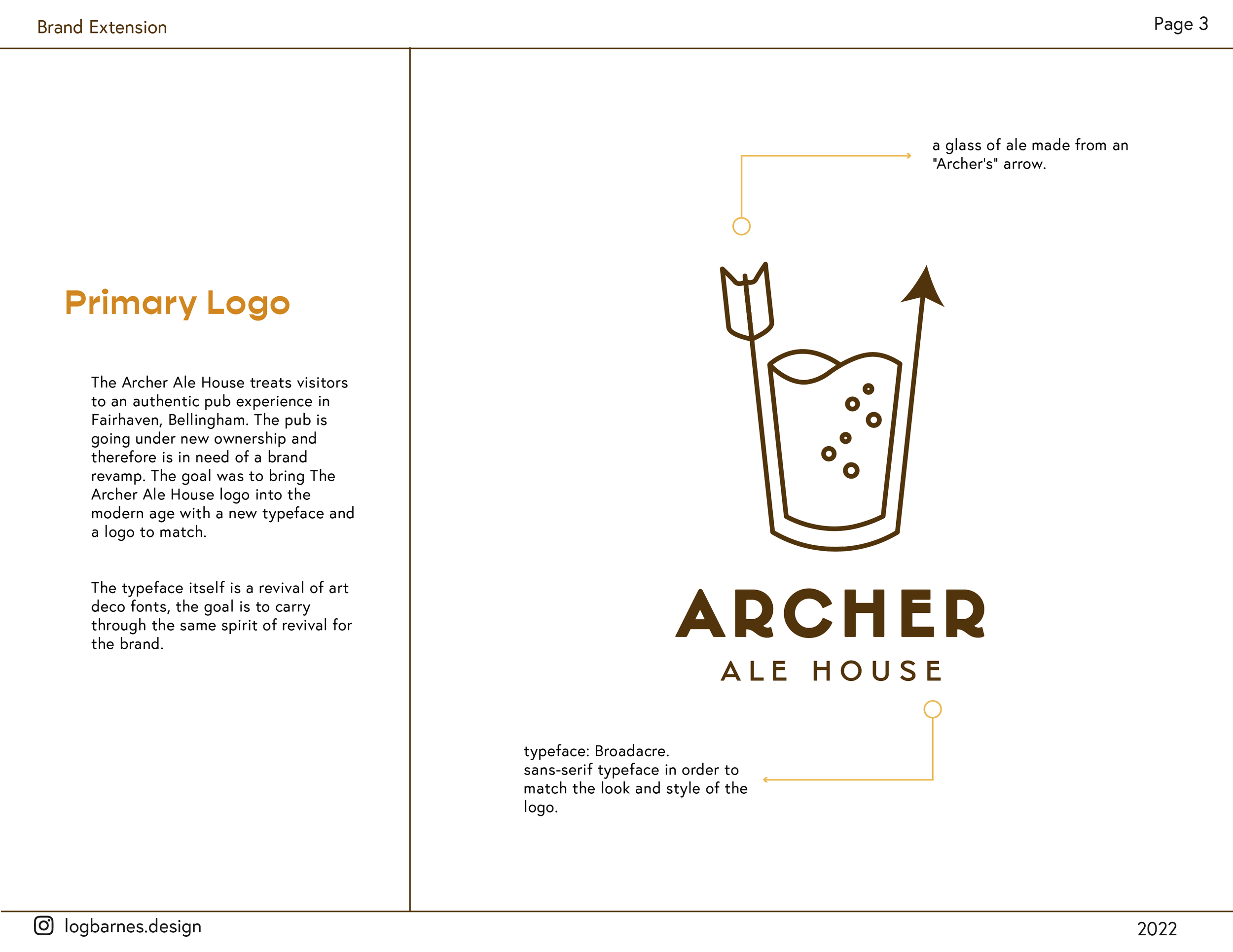
Bringing a sense of upperclass and sophistication to a pub while still appreciating the beauty of a cold draft beer in a glass with the bubbles racing to the head!

Sketch, Sketch, Sketch!
There was a lot of process and critique time with the Archer Ale House logo. Capturing the correct mood and feel for a pub through a logo requires a lot of insight!
The ideation and brainstorming began with mind mapping and quick sketches. For most of the sketches I focused on the ‘Archer’ aspect of the brand and utilized the arrow in most of my designs.
An idea that stuck ended up being a martini glass, this was the seedling for the current logo design, however many iterations of cups were explored to find the perfect fit!
Exploring Many Paths…
I wanted to give each path the same amount of effort and attention. I captured a unique trait in each logo path and created a branding option for each one as well as exploring color and font options for each logo. I was careful to keep the layout of each logo sheet consistent in order to keep the clients view of them unbiased. I also explored unique traits of each logo to show versatility!


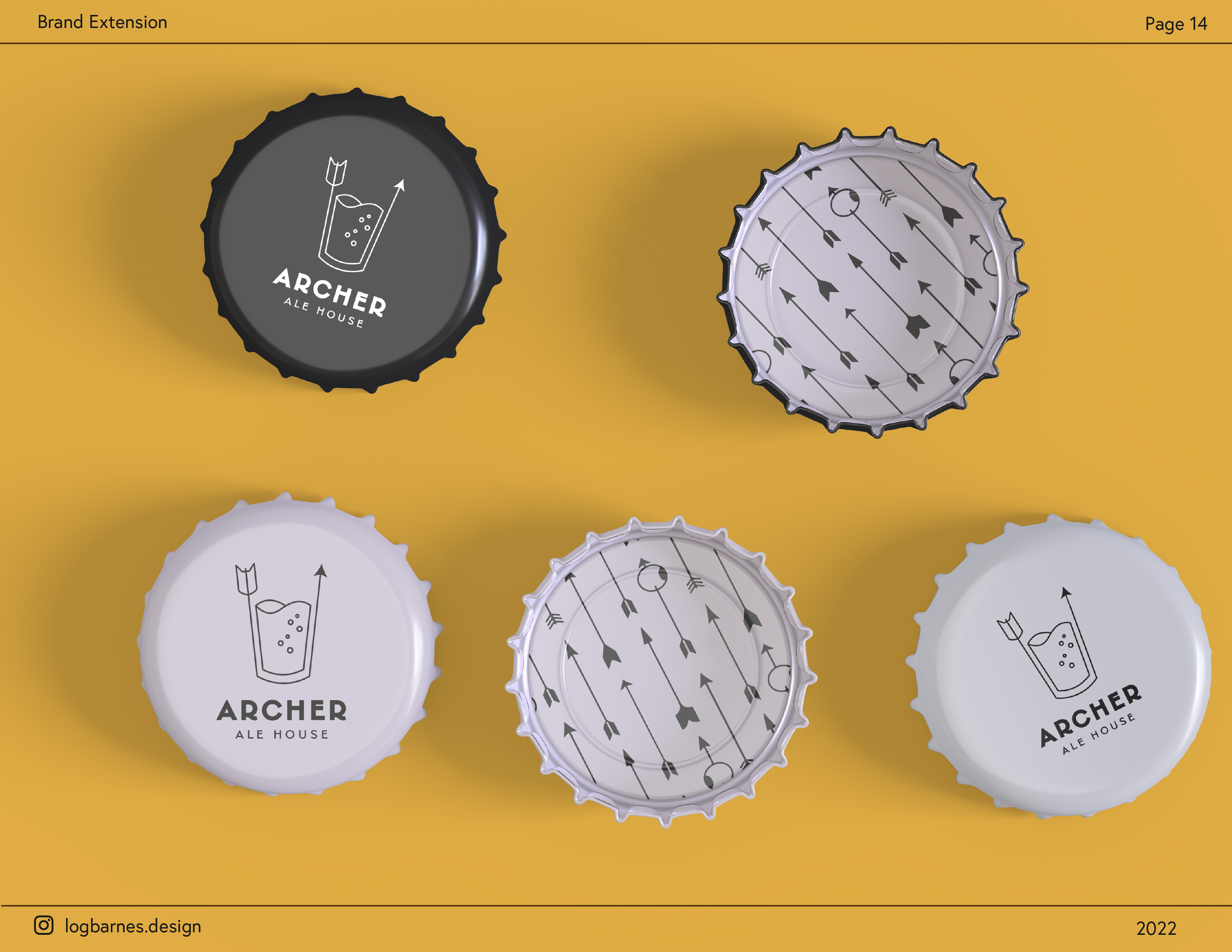
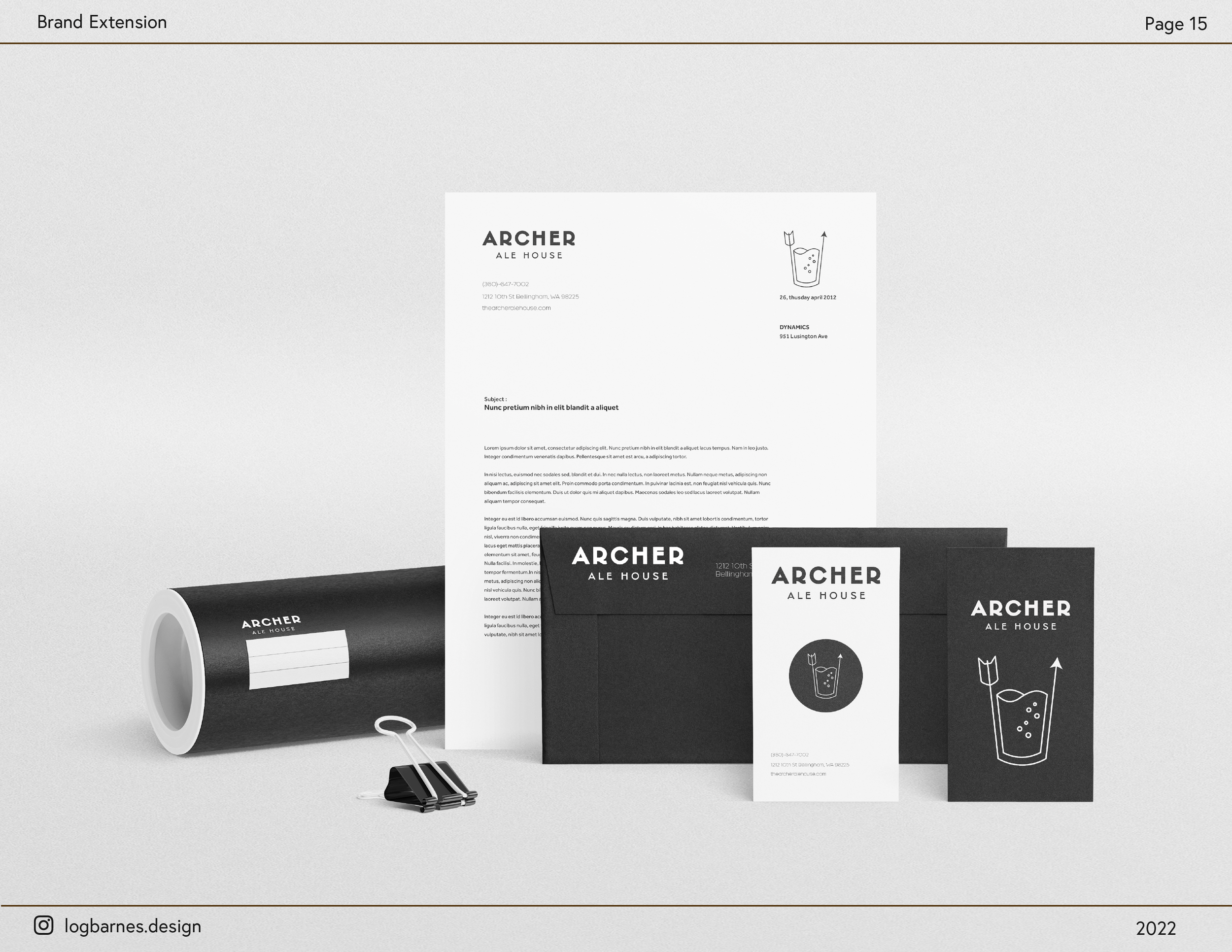
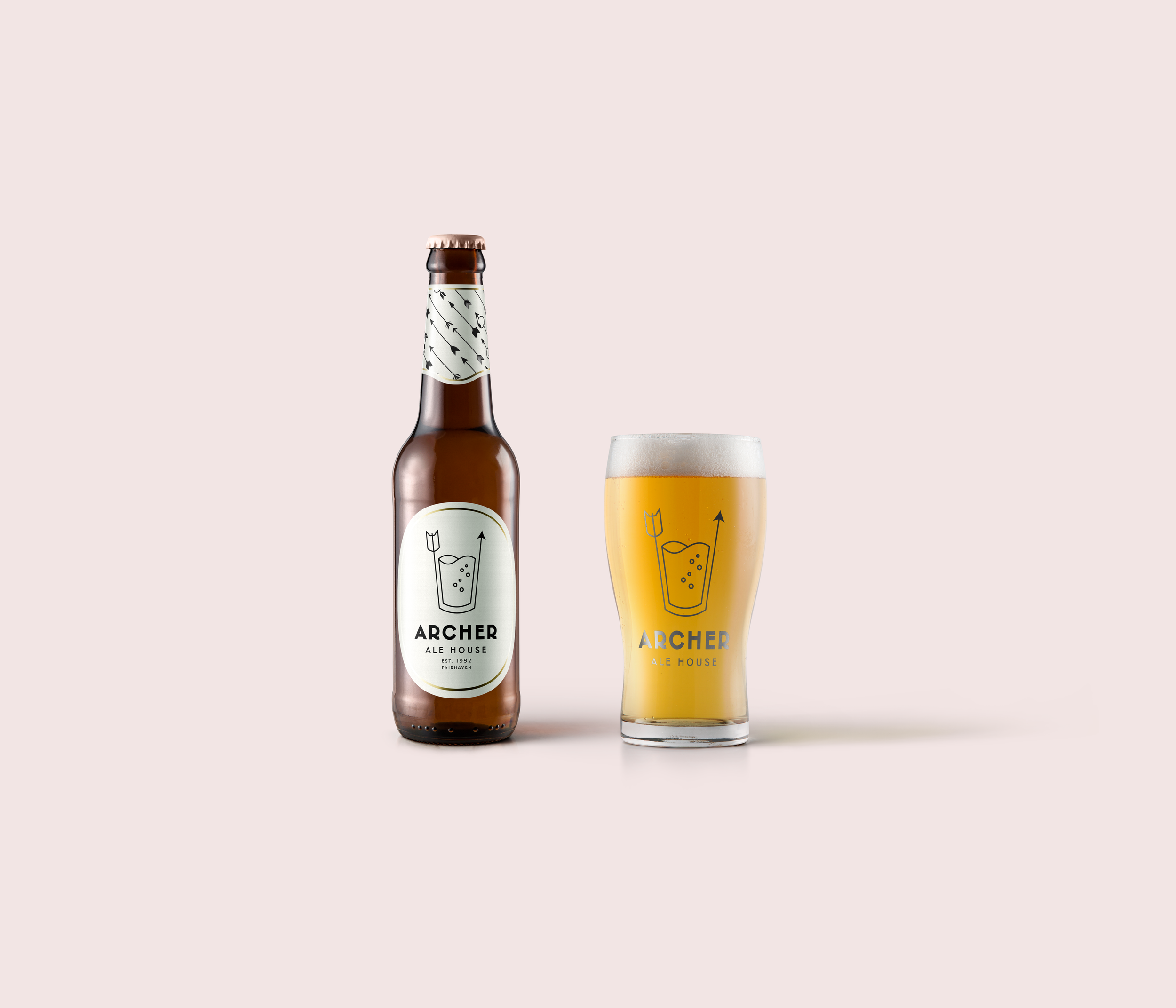
Brand Extension
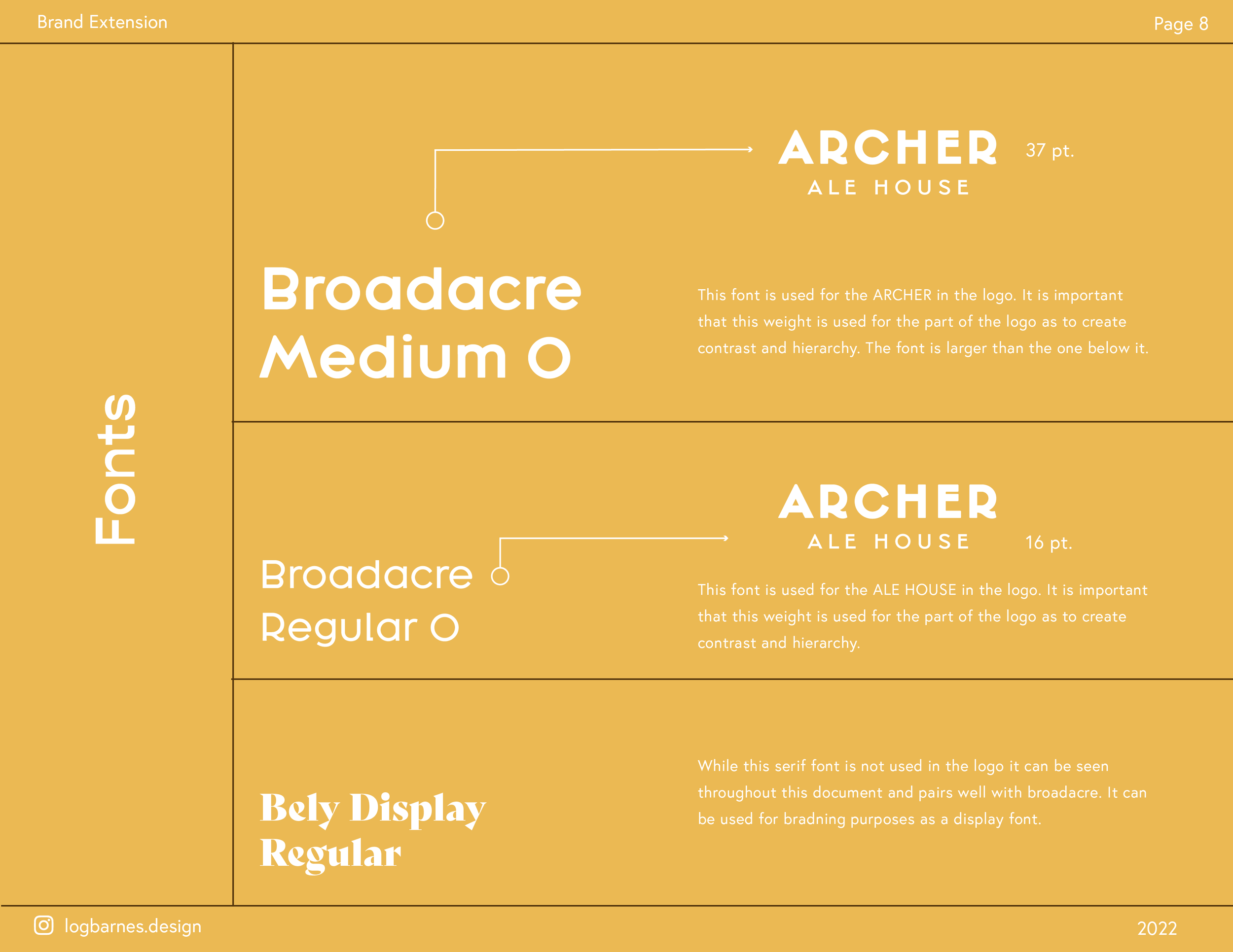
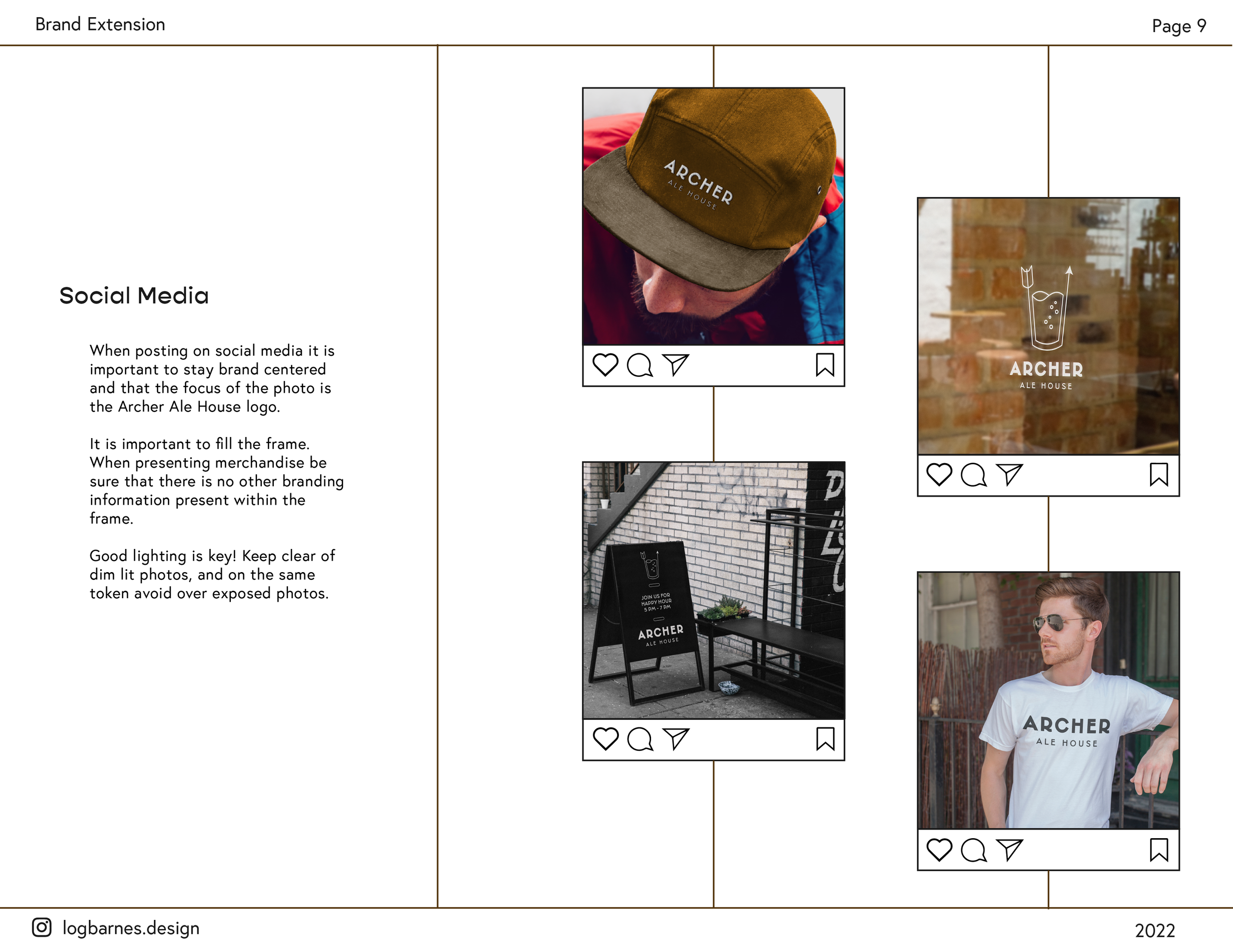
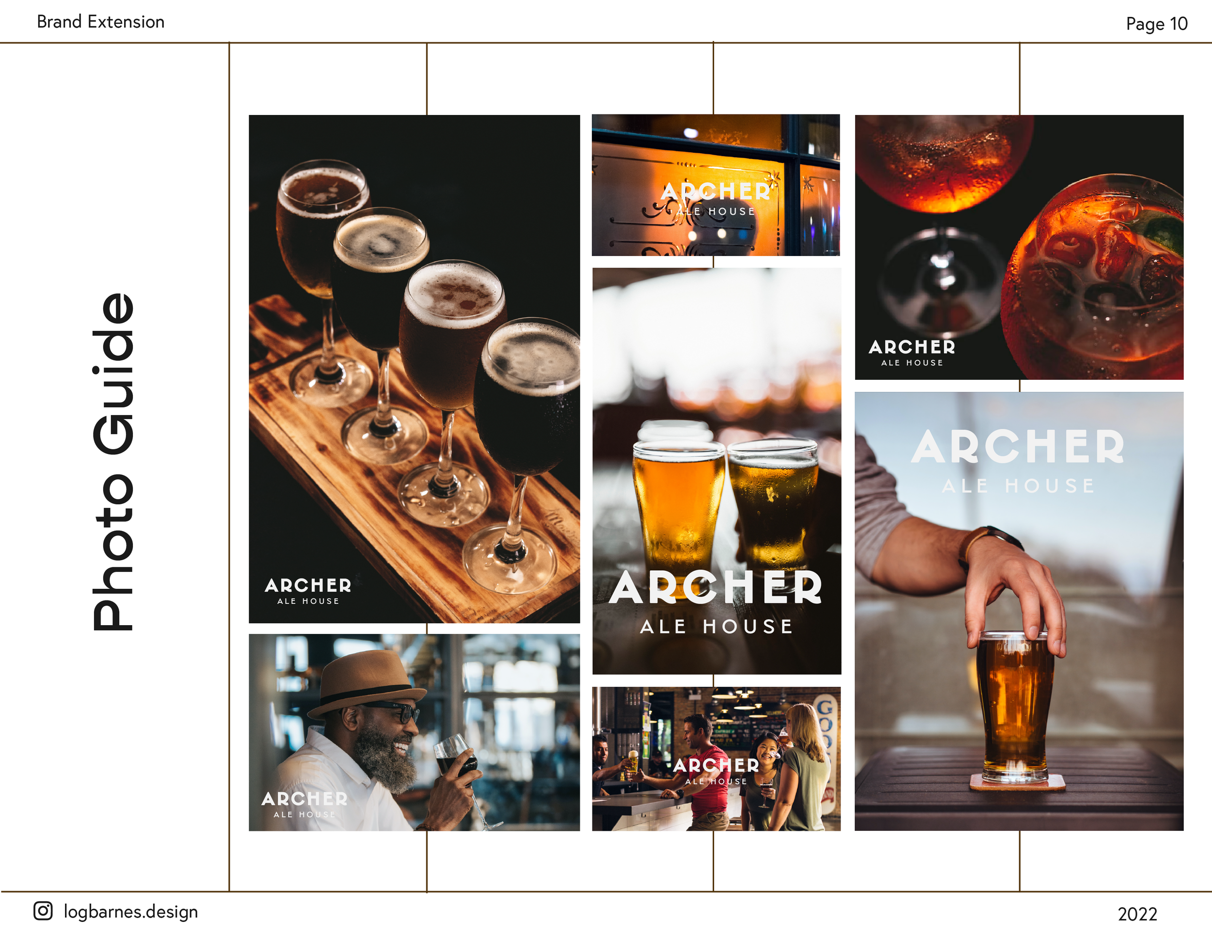
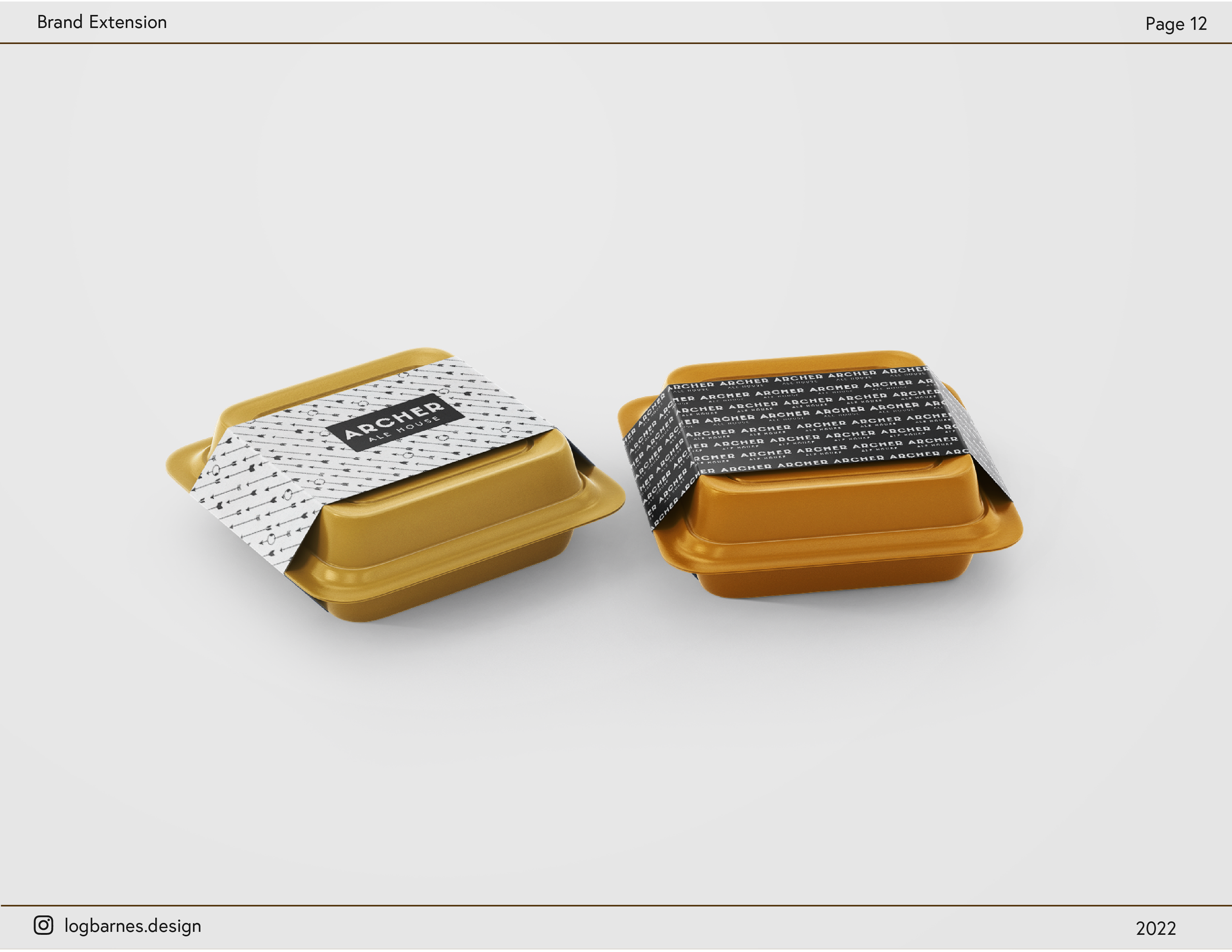
The brand extension details how the logo and brand should be used. It explicitly explains how to use color codes, spacing, fonts used, and more so that any designer who works with the Archer Ale House brand will be set up for success!