Chocolove Redesign
Bringing a luxury feel to a premium product.
Picking the Brand
The product I chose was Chocolove Premium Chocolate Bars. I decided to do a rebrand of the product in order to deliver a more premium experience to the consumer. The current packaging doesn’t necessarily feel high-end. The bright colors and messy fonts give the bar an imported feeling for sure, but I wanted to elevate the experience of the bar to make the price point more worth it to the average consumer.
Preliminary Research
Audience
College Students
Supporters of Liberal Arts
Image Conscious
Moms
User Goals
High-End Snack
Feel Fancy for a Moment
Get as a Gift
Surprise Gift Inside
Current Form and Perceptions
The Chocolove bar currently uses images of the flavor as its main graphic accompanied by a bright color that is also associated with the flavor.
Chocolove brands itself as a premium chocolate bar, it seems that may be the reason for the gold foil around the bar that the consumer can see once they remove the initial packaging.
Messages to Communicate
Artsy
Premium
Natural
Trusted Sources
Existing Message
Chocolove aims to bring an exotic twist to chocolate. The packaging appears to be shipped over seas with the stickers adorning the exterior while the chocolate actually comes from Colorado.
“Chocolove is a chocolate manufacturer with headquarters and a manufacturing facility in Boulder, Colorado, founded in 1995 by entrepreneur Timothy Moley. The company produces all-natural and organic chocolate bars. Chocolove imports chocolate and cocoa butter from Belgium” to produce its chocolate.
“Our certified source of cocoa beans is traceable to the farmer. Our non-GMO verified ingredients are another way to know where our ingredients come from and to show that we care to buy the very best. Great effort is made to deliver consistent great taste so you can feel great about eating Chocolove. That is why Chocolove consumers say, "I love Chocolove".”
The Problem
Chocolove has an above-average price for chocolate because it promises to deliver an above-average experience for its consumers. while I’m sure this is true to the flavor and quality of the bar, their packaging falls short and feels busy and outdated. a premium experience should include every aspect of the product.
Chocolove also provides consumers with a poem inside of each bar, however, once the poem is read the wrapper will still likely be tossed, especially because the consumer may not like the poem they get because they don’t know what they will get when they buy the bar.
The Solution
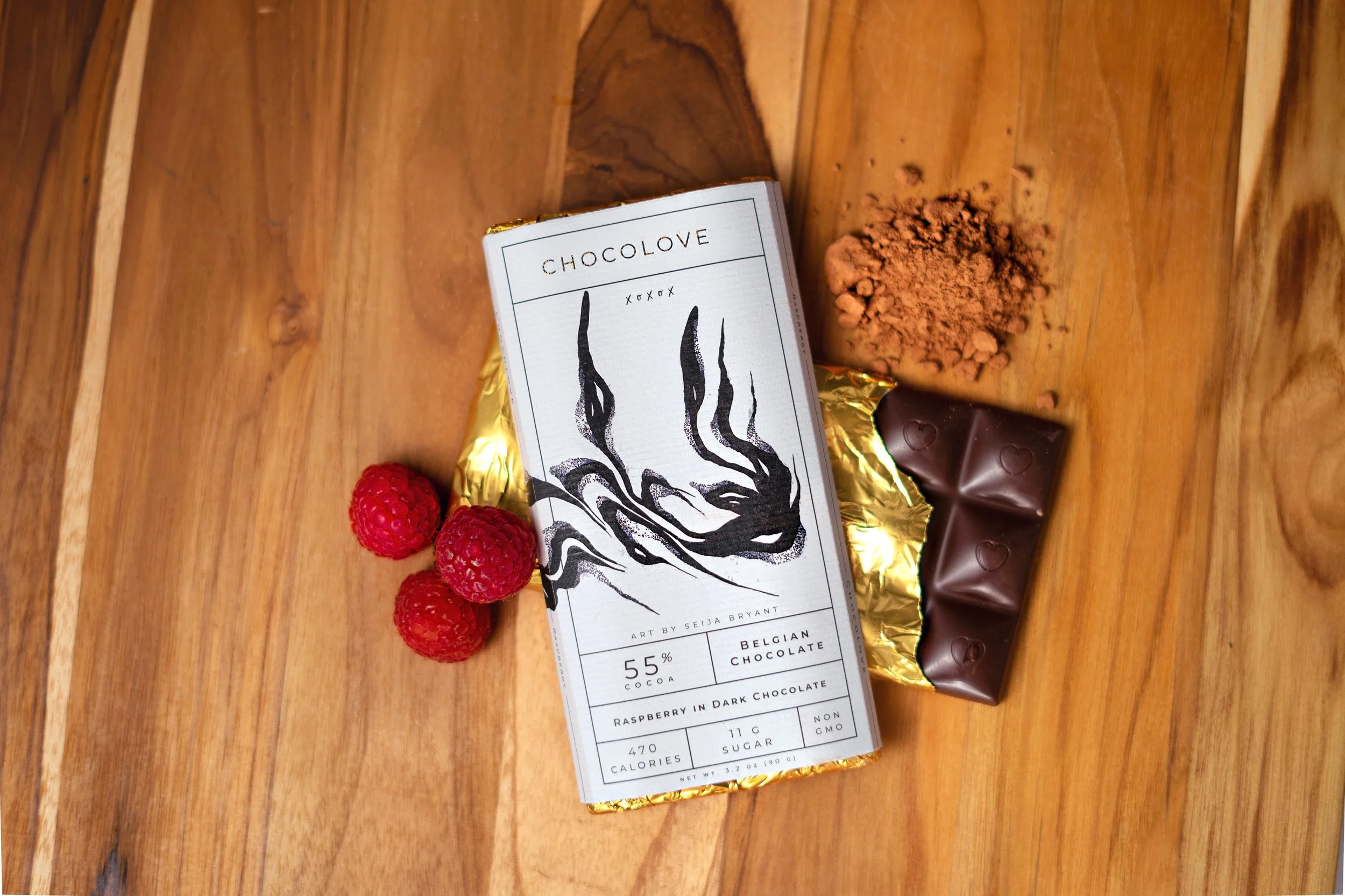
In order to make an all-around premium experience for Chocolove consumers, I will bring attention to the gold foil already present in the Chocolove packaging.
I will update the typeface to something cleaner and more elegant.
The art aspect of the bar will now serve a purpose, the free poem was a good jumping point but my rebrand will include a free poster designed by a local artist, that art will be the centerpiece for each bar. Consumers will get chocolate and a poster with their purchase!
Mood Boards and Sketches
Finding a creative direction that will elevate the brand.


Prototyping

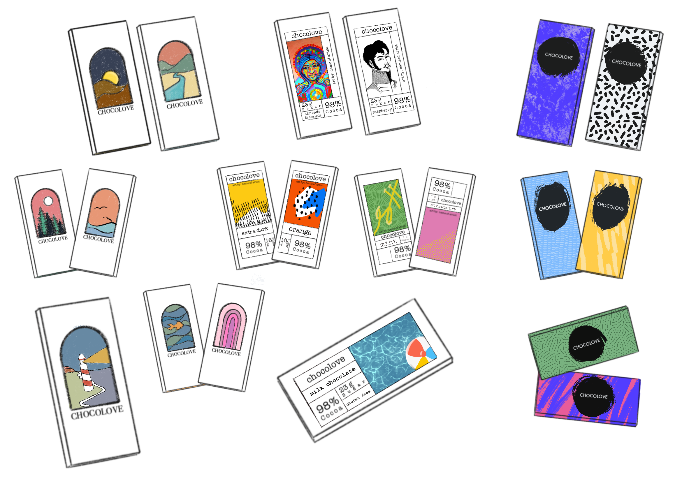
Prototyping Round 1:
The first round of prototypes displayed the idea of artwork at the fore-front of the packaging. Moodboard #2 was implmented here and I tried to emulate the courier typeface. I made 2 orientations of the bar, both of which have open ends in order to display the gold foil inside.
Prototyping Round 2:
Prototyping Round 2:
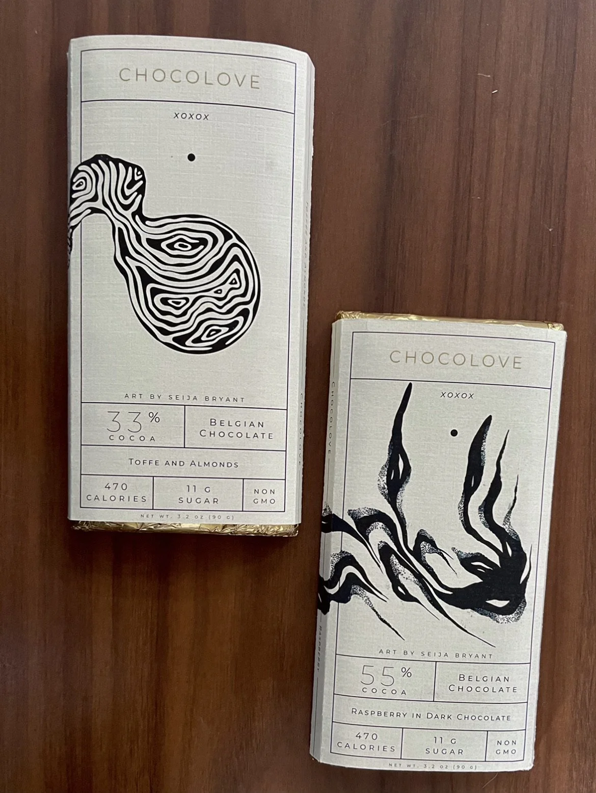
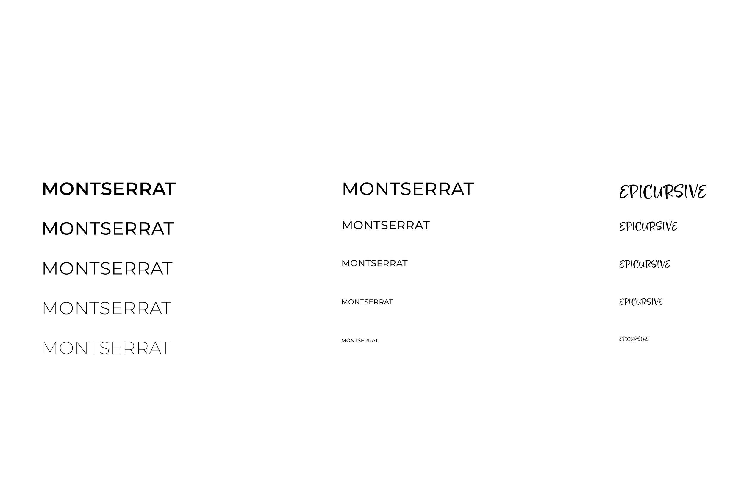
The second round of prototypes look much different that the first. After re-analyzing my goal I realized I was lacking on my goal of making the bar feel premium and high end, in order to rectify that I got rid of a lot of color and focused on a b&w route that highlighted the gold foil. I also abandoned the courier idea and replaced it with small-caps montserrat.
Lastly, I got in contact with Seija Bryant, the artist I chose to highlight through this project and got their permission to use their work as the centerpiece of my packaging.
Assets and Typography
Selecting artwork and typefaces that would be a perfect fit for my product.
Art by Seija Bryant.
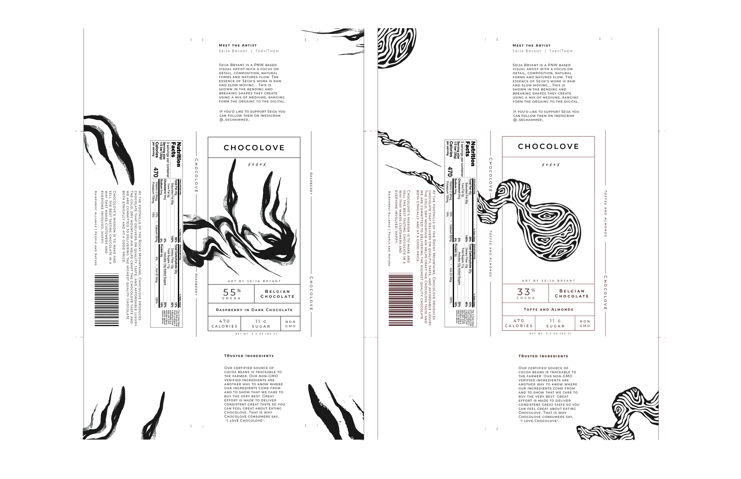
Final Packaging
After taking in and applying feedback, I was able to increase the typographic hierarchy through contrast. The design effectively wraps around the packaging and creates an experience for the user as more information comes available as the user opens the wrapper. It was important to make all parts of the packaging look appealing as this is a premium chocolate bar.

Surprise Inside
Once the entire bar is unwrapped, the interior part of the wrapper contains a full-sized image of the art presented on the front of the bar. The art will be undamaged as all adhesives will be strategically applied.
The art is all local and intended to support and bring awareness to artists in the area the bar is being sold.


